#more like picking color palettes
Explore tagged Tumblr posts
Text
Cora Lives Au + Egghead Outifts

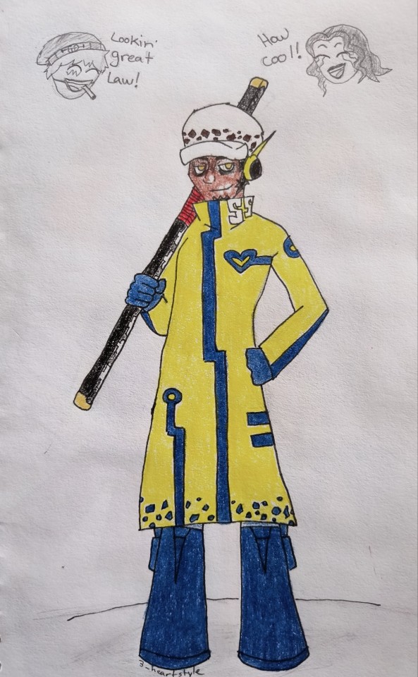
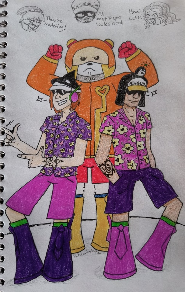
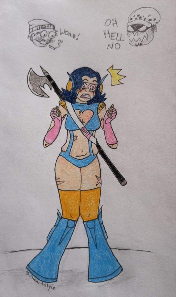
Bonus doodle:
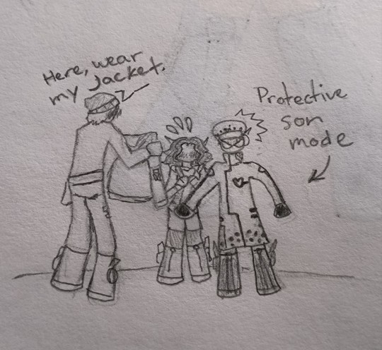
#I hate coloring#more like picking color palettes#I regret the colors for Penguin and Shachi but oh well...#donquixote rosinante#donquixote corazon#trafalgar law#op bepo#op penguin#op shachi#heart pirates#one piece oc#corazon x oc#one piece#my art#cora lives au#Egghead#oc: layla montez
60 notes
·
View notes
Text

Useless // Finally Shattered
I didn’t know which title of those two to give this, so take whichever one you will— either way my shinenigans of putting Arin through trauma continues (and I actually really like this one agjhjhhghs)
Lyrics from The Hand That Feeds - The Crane Wives
#ninjago dragons rising#ninjago fanart#ninjago arin#arin ninjago#dragons rising arin#arin dragons rising#arin + a red colour palette = new fave ship#also arin + the crane wives songs (they’re all just so him coded istg)#there’s an alt version to this but i like this one more#ninjago#lego ninjago#dragons rising#cablart#ninjago dr#ninjago dr s2#ninjago spoilers#idk whether to tag this for evil arin#because that could deff be a reading of this#either he just saw lloyd die or killed him#pick whichever you like more#cw bright colors#tw bright colors#cw blood
906 notes
·
View notes
Text
Perler Bead Flight Flags
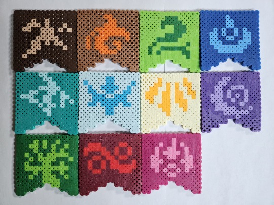
Made these flight flag coasters a bit back, figured it was a good time to post 'em! I do enjoy Perlers, they're like pixel art but at the end I can hold them and stuff.
Crafting details after the break, if y'all want to make your own.
These are using the original 2013 flag designs/colors on a 14x14 board, with standard 5mm beads. If you wanted to do the current flag designs, they'd need a little bit of tweaking as many are more symmetric in the current art (and also, I'd recommend a 16x16 size, since then you have room to put the current art's border). You could also try out an odd-sized flag, 15x15 maybe, but the angles at the bottom will look a little off. Doesn't hurt to try stuff though!
I got most of the beads for these out of variety packs and various kits, which don't necessarily label the colors in them, but these are my best guesses to what I used:
Earth: Tan design on Brown base
Fire: Butterscotch/Orange on Light Brown base
Wind: Dark Green on Kiwi Lime
Water: Light Blue on Dark Blue/Cobalt
Lightning: Toothpaste on Parrot Green
Ice: Turquoise on Robin's Egg
Light: Cheddar on Creme
Shadow: Pastel Lavender on Purple
Nature: Kiwi Lime on Dark green
Plague: Red on Cranapple
Arcane: Pink on Raspberry
(Most of these came from the Multi Mix packs or the Neutral Colors/Fun Colors trays, but Cranapple in particular was catankerous to get ahold of. Fitting for Plague, I suppose! Anyways, there's some wiggle room on hue for a lot of these, too, I was just using what I had onhand as much as possible)
As for what I would do differently if I made another set of these? Well... I've gotten a bit better at getting the melt level consistent, so there's that. Learned the hard way that trying to melt two designs on the same pegboard, even if said board is big, isn't a good idea (and it's near-impossible to fix). Also, I was using one of the freebie folded pieces of parchment paper, so some of the coasters have creases... On non-ironing notes, I think it would be fun to take a stab at a micro-bead variant, since they support a higher dpi and all!
Anyways, if you decide to make your own set, please uh... I'd say ping me, but I'm not actually sure how that works here? I think it'd be cool to see 'em, that's all. Happy crafting!
#flight rising#frfanart#fr fanart#perler bead creations#flight flags#I picked the 2013 flags because I prefer the palettes used on them#There's no arguing that the newer flags' art is cleaner#I just miss the cream/gold Light Flight banner as opposed to the yellow/brown#I will say that Fire's newer colors are more my jam though (debated making just that one new colors#but decided the mismatch would be worse)#Personal taste really#...I say “new” but the flags changed in like... 2016... I'm old.#Anyways my desk is covered in coasters now; send help?
331 notes
·
View notes
Text


day 3 of @deadboystims’s 300 followers event
a board based on your favorite stim creator/use their original gifs!
I have many beloved stim creators but I chose @talos-stims for this one bc its gifs SLAP
sources: 🍁🥮🍁 | 🥩🌱🥩 | 🍁🥮🍁
#shout out to talos stims THEE superior gif maker fr fr 💪💪 if nobody got me I know talos stims got me etc etc#I did struggle with this one at first bc I couldn’t decide if I wanted to make like a gift board or just pick gifs that I personally like#I ended up going with more of the second one. always time to make gift boards another day ;)#still had to squeeze a little bit of meat and pigs in there tho ofc. it just wouldn’t be right without them#anyways I rlly like how this one turned out actually!!!! loooove the color palette :))#stimboard#deadboy300#farmcore#kinda#meat#cooking#nature#forest#food#knives#animals#sunlight#stim board#my boards#personal boards#green#brown#red#orange#yellow
89 notes
·
View notes
Text
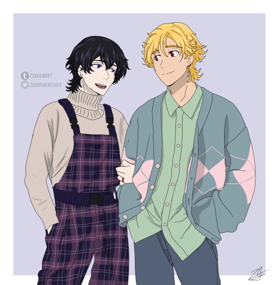
More Clothing Practice ft. Kazurei ❤️💙
Happy Buddy Daddies Friday!
#I did randomized color palettes for them too#because why not#also Rei smiling and talking more after they adopt miri and get married is very important to me#the most fashionable daddies at daycare#they’re on their way to pick miri up from school here#kazuki loves listening to him talk#he infodumps about the things he likes and Kaz just watches and listens like 😍#anyway happy buddy daddies Friday!#I want to keep practice clothing so if anyone has any ideas lmk#preferably like everyday/normal formal wear#also every time I draw them I add more and more piercings#maybe one day I’ll make like a piercing/tattoo hc post#kazurei#buddy daddies#buddy daddies fanart#my art#reikazu#kazurei fanart#reikazu fanart#zsart
226 notes
·
View notes
Text

Reverse Gondolin Tyelpe!
outfit inspired by this post by @thelien-art
#silm#silmarillion#reverse gondolin au#celebrimbor#tyelpe#tyelperinquar#decided he goes by his quenya name for ondolindrim purposes#fun facts abt his design!#when he formally disowned the feanorians he switched bloodred for pale slate and gold for bright silver#and changed his accent colors to finwe's dark fuschia-red#his outfit is somewhat referencing turgons w the black underlayer and the light outer robe with red accents#the heraldic belt is somewhat referencing gils device since in the au lomion & tyelpe adopted gil#the pattern on the hem of the outer robe is similar to the YT valian fashion though the cut of the sleeves is a rev gondolin style#his hair is unusually short- at this point he wears it in a simple bun#he picks up his signature half style after lomions death :(#the double necklace thing forms a similar shape to the YT era mantles/shoulderpieces#and the shape of his second dark layer is like a more modern version of the heavily layered tirion style formalwear#basically his style is 'slightly updated finwe' in a darkened version of lomion's color palette#the feanorian star in silver is his specifically#the feanorian star in gold is feanor's#(sorry curufin you don't get your own star)#he also accidentally spawns a new linguistic rift via the addition of the Gondolin Accent to the Thorn Problem#gnomish seems to have some weirdness around th- words (ie sorontar (Q. N) /thorondor (S) /thorndor (G) )#so theres def going to be a fight or three over the gondolin/gnomish pronunciation in relation to therinde
44 notes
·
View notes
Text
Hey remember when I said I wanted to redesign God!Lunar again? that was over a month ago

I did it I did the thing
Also here’s an alt version below the cut without the cape just to see what’s under it for reference reasons
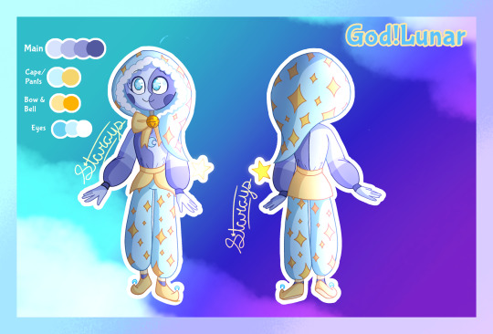
#God!Lunar AU#God!Lunar#sun and moon show#tsams#tsams lunar#tsams au#tlaes lunar#maybe?#I had fun picking his color palette#ended up using more yellow than his original design#I like it#the star on the end of his hood glows#also I like to think it’s not attached but it just kinda floats in place as if it was#oh same goes for the little blue crescents on his shoes#they just kinda float there
228 notes
·
View notes
Note
do you approach your art as pixel art or as low resolution digital art? or something else entirely
a little bit of both, but mostly just regular drawing/painting with some "pixel arting" tiny details like pupils and nostrils. Any really small or thin shape i'll draw in and tweak individual pixel until i'm happy with the shape
i just love the gritty texture you get with a pixel brush :)
#not art#also i think pixel brush has really imrpoved my art unironically#i can go faster because its easy to use just one or two layers since you can perfectly select what area to draw#like selecting everything except outlines to draw inside the lines without having lines as a layer on top#being able to change colors of anything at any time no matter how merged the image is#the sharp edges mean i dont rely on blending brushes for shading and i feel like i pick light and shadow colors a lot more intentionally#and end up with more fun vibrant colors overall imo#and the this is more about the philosophy of pixel art than about the brush but i really like trying to limit my palette to 6-8ish colors#sometimes i go way over sometimes i dont care but the idea really helps keep my colors more cohesive overall#and its really fun going over a piece and figuring out which colors can be combined and eliminated#in conclusion pixel brush my beloved
69 notes
·
View notes
Text
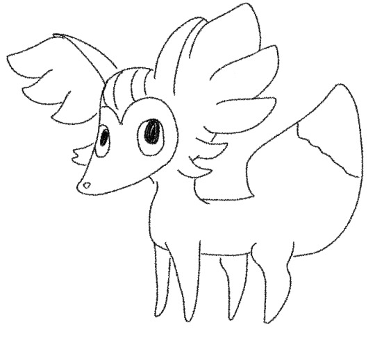
She’s preparing for her magical girl transformation :)
#653#fennekin#pokemon from memory#THIS was who I picked :3#The cutest of the three first forms imo#As with gen 5 I went into this one totally blind#I can see the appeal of delphox#And some of their official art is nice#But the way they were rendered in 3D…I just couldn’t bring myself to like them :(#They’re just so…🧍#They just stand there#Gonna be old for a minute and say I miss the 2D sprites#They had so much more personality to me#The 3D ones really just stand there#And their color palettes look washed out#And bc so many of them are made of strange shapes they get rendered…….creatively
3 notes
·
View notes
Text

#this was going to be a part of that pick a song and i'll draw it meme but i couldnt get the lyrics on here in a way i liked#so now its just a standalone drawing... the og song was compressor repair by emperor x though. still inspired the vibe.#reusing a color palette from my last drawing hehe... trying to feel better about posting more 'casual' things here..!#ocs#reid#distaxon
4 notes
·
View notes
Text
wait i did remember but im still leaving that post as is. the thing that finally convinced me to get ts4 (admittedly not particularly long after its initial release but still) was seeing a screenshot of a house someone had built & just how like. clean & polished it looked. & how vibrant the colors & lighting were. ts3 really suffered from the attempted realism with like every little overly detailed wood grain & fabric texture that kind of made it feel very busy & almost like. dirty?? & ts4 just like. did away with all of that & it looked so refreshing. & admittedly i disagree with some of the design choices (a lot of the hairs are so. so chunky. like i like the shapes but why are they so big) but overall i really do think its a more aesthetically pleasing game. & i also think the simpler style has helped it hold up for as long as it has. looking back at ts3 its like. oh that did not age very well actually. but i feel like games that are more stylized dont suffer as much from that
#i do kind of wish they had included something similar to the fuckin. design tool thing in ts3. but less complex#like i dont need to be able to pick from Every Single Texture for every portion of this item#but it would be nice if instead of like. a button down shirt where black has gold buttons & red has black buttons & blue has silver buttons#i could be like. ill do the red shirt with the silver buttons actually. u know?#just like. whatever swatches they have just make separate options for each piece. for those specific colors youre already making them in#like youve already MADE the shirt in black & red & blue and youve already MADE the buttons in gold & black & silver. let me mix & match#also i wish there was more consistency in palettes between packs. like all the dark browns are different. strangerville didnt even have#black windows or doors. these sofas from different packs would match really well except that they dont have any similar swatches#like i WILL make recolors if i really want to but ugh .
2 notes
·
View notes
Text

A word called water, a word called evil, we shall change those into a song.
Design by @asheoninactive / @kuroshirosb !!
#Cherenverse#JRPG AU#My Art#((Ashe told me I was free to pick a palette and I was initially wondering if I should keep his polo and pants like. White/navy blue/black.)#((Because they're all wearing uniforms. But then I thought that their classes would have different vests as a result since they also have-)#((Other accessories to go with their uniforms. So I went with giving Slater mostly his usual color palette.))#((I initially tried to give him his regular palette but it looked off to me ...))#((And I didn't want to just use the Lower palette so I kinda compromised by making the Lower palette more vibrant-))#((-and adjusting the colors of his hair and skin to fit the vibe of the brighter Lower palette.))#((And ofc struggled w a background. Shapes.))#((Anyway here he is! The Songster <3 That I keep misremembering as Songstress but gender isn't real anyway its fine /j ))#((I care him. Choirboy that just wants to be useful and sing his songs.))#((Unwittingly a mouthpiece for Plasma's propaganda. Some kind of angel.))#((His outfit looks like a little conductor..))
13 notes
·
View notes
Text
wow this art is so beautiful this artist is so good at colors
they must be a final fantasy 14 player
i check their profile
they are a final fantasy 14 player
#theres some inherent quality about how they choose colors that just alerts my built in final fantasy detector#its not even like 20 cases its more like 100#when the light the border of light the shadows are all colorful and they really know how to choose brown shades its somehow always a ffxiv#im being deadass about the brown part#like ill go right now find you 12 samples. you pick the ones done with most finesse. it will always be a ffxiv player at the top#if i play will i become the god of color palettes too?#maybe its something to do with how the bloom filter works in that game the artists just get used to it?#not sure but whatever it is i worship them
3 notes
·
View notes
Text
I always get WAYY too entertained by those dumb videos on like instagram where people will make makeup palettes based on characters or objects by color picking, so I thought I'd try doing it myself.

Here's a Link one I made, might make more later, making fake makeup palettes is very fun and therapeutic.
Here's some templates I made for this, hearts, circles and diamonds


#Link The Twink#my art#??#I don't think this counts as much as my art#since It is mostly just me making circles and coloring a little#i've been feeling a bit burnt out lately so this was kind of fun#If I Was good at names I think I'd give each of the colors on this palette a name#if anyone does use these templates please tag me I love seeing these#also if this many colors overwhelming you can cut off the side and just do the 9 with 4 picked colors in each corner#I just added some more for additional colors#so like for me on the side I did his hair highlight and glow for a fun sparkle palette
12 notes
·
View notes
Text
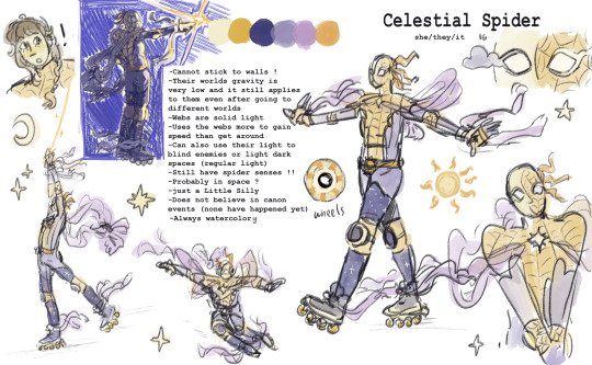
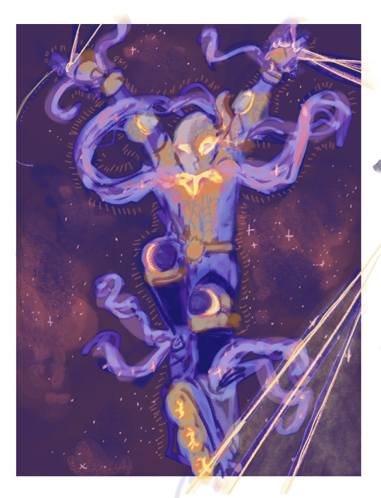
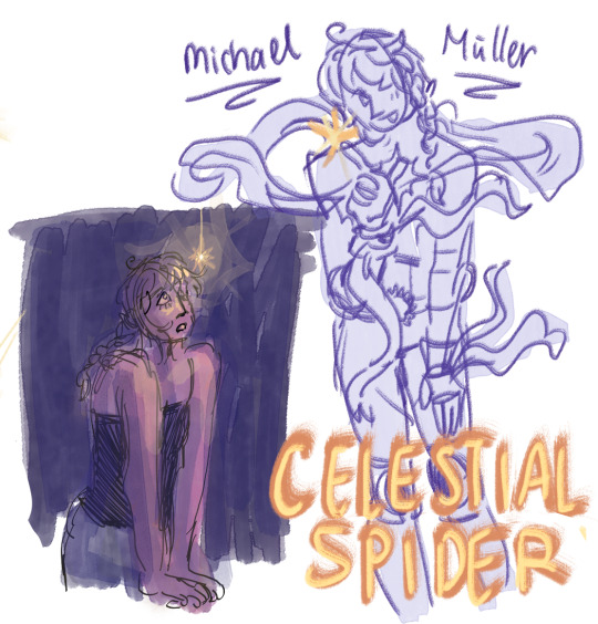
from when i made a spidersona whaterver
#sun.art#i dont wanna main tag spidersona but this is fine too probably#ive got like 10 different drawings where i tried to pick a color palette#i think the yellow could be brighter and more warm/orange but this is ok ..#the 2nd is fun i did a gradient map ^_^ u can see how fucked up the arms and hands r i probably couldve looked at spiderman pose references#but i like it !!!
9 notes
·
View notes
Text
Color Palette Challenge: ORANGE BRACKET

#color palette meme#challenge#color palette challenge#breezy babbles#breezy polls#color poll#orange bracket#polls#orange#color wheel#SOME OF THESE ARE A STRETCH BUT CONSIDER....it'd be fun#esp ylfa since I mean....she's literally little RED riding hood but MAN she was obsessed with that hat#I think it's funny#I almost put Caleb from CR but mmmmm would like to draw ylfa more if she gets picked by some weird twist (I doubt it)#we'll see how this turns out#have at ye
13 notes
·
View notes